Looking Out Long Form #1
Drew tries to understand why Apple's new CarPlay still looks so bad.
23rd December, 2023
Welcome to Looking Out, where we connect the dots across the automotive industry, mobility, design, and culture. Looking Out is brought to you by Joe Simpson and Drew Smith of The Automobility Group. If you like what you see, tell your friends!
Catch our latest podcast on YouTube or your favourite audio platform.
Why it’s interesting: For those interested in automotive UX design, the arrival of Apple’s second generation CarPlay has been eagerly awaited. On the current evidence, we might have waited in vain.
A little while back I wrote about the luxury of consistency.
The prompt was Porsche’s deeper integration of Apple’s CarPlay in to their vehicles: with a software update, the central displays in certain models could provide owners with a greater level of access to in-vehicle functions, like climate and ambient lighting, all through the familiar CarPlay interface.
My contention was that – given over 80% of Porsche customers are iPhone users and that car companies have historically been poor designers of digital interfaces – this development would provide the kind of experiential consistency that’s long been an implicit value of great luxury brands.
By giving up ownership of the interface to Apple, a company widely-regarded for great user experience design, Porsche was in fact creating the conditions for a more seamless, consistent, and therefore luxurious experience within its cars and across owners’ digital devices.
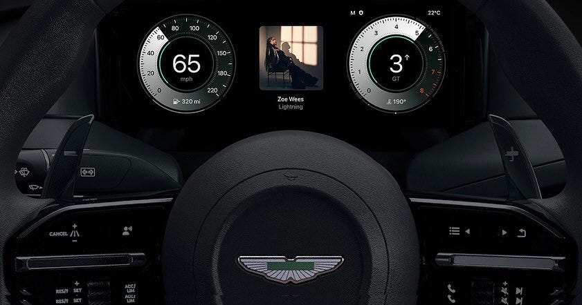
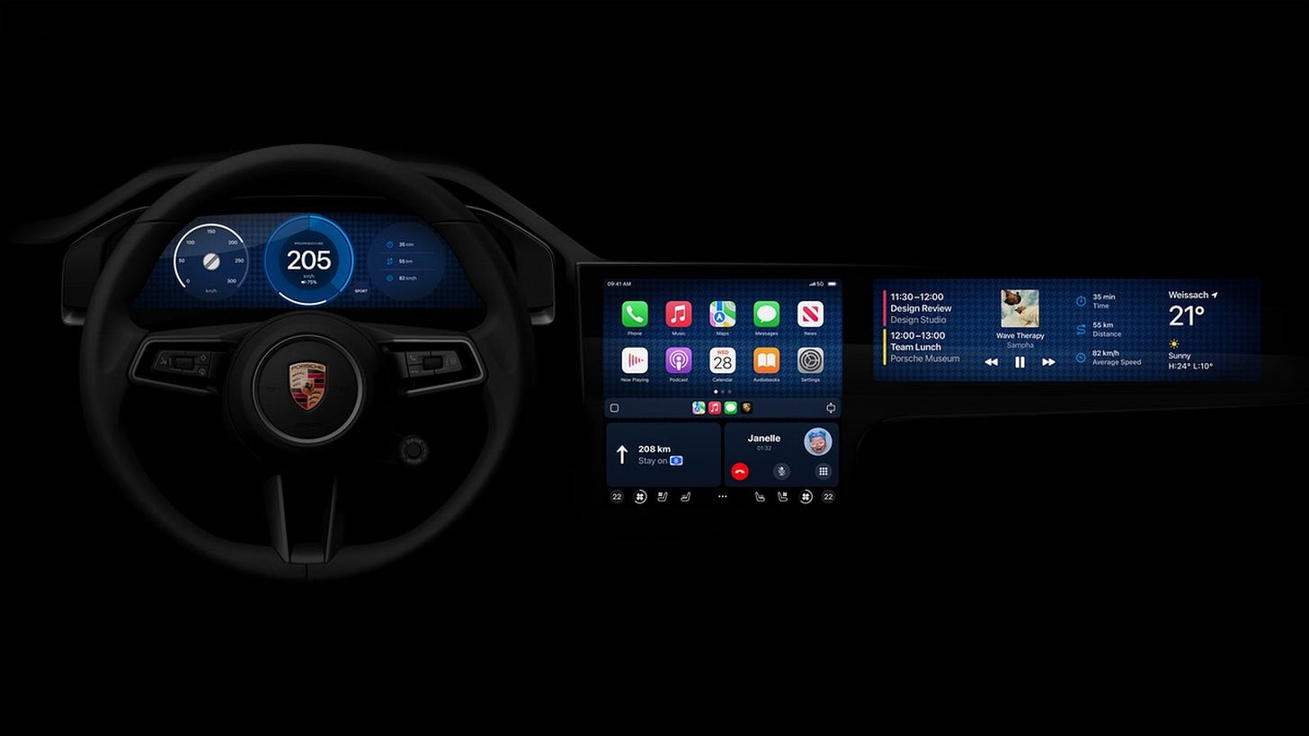
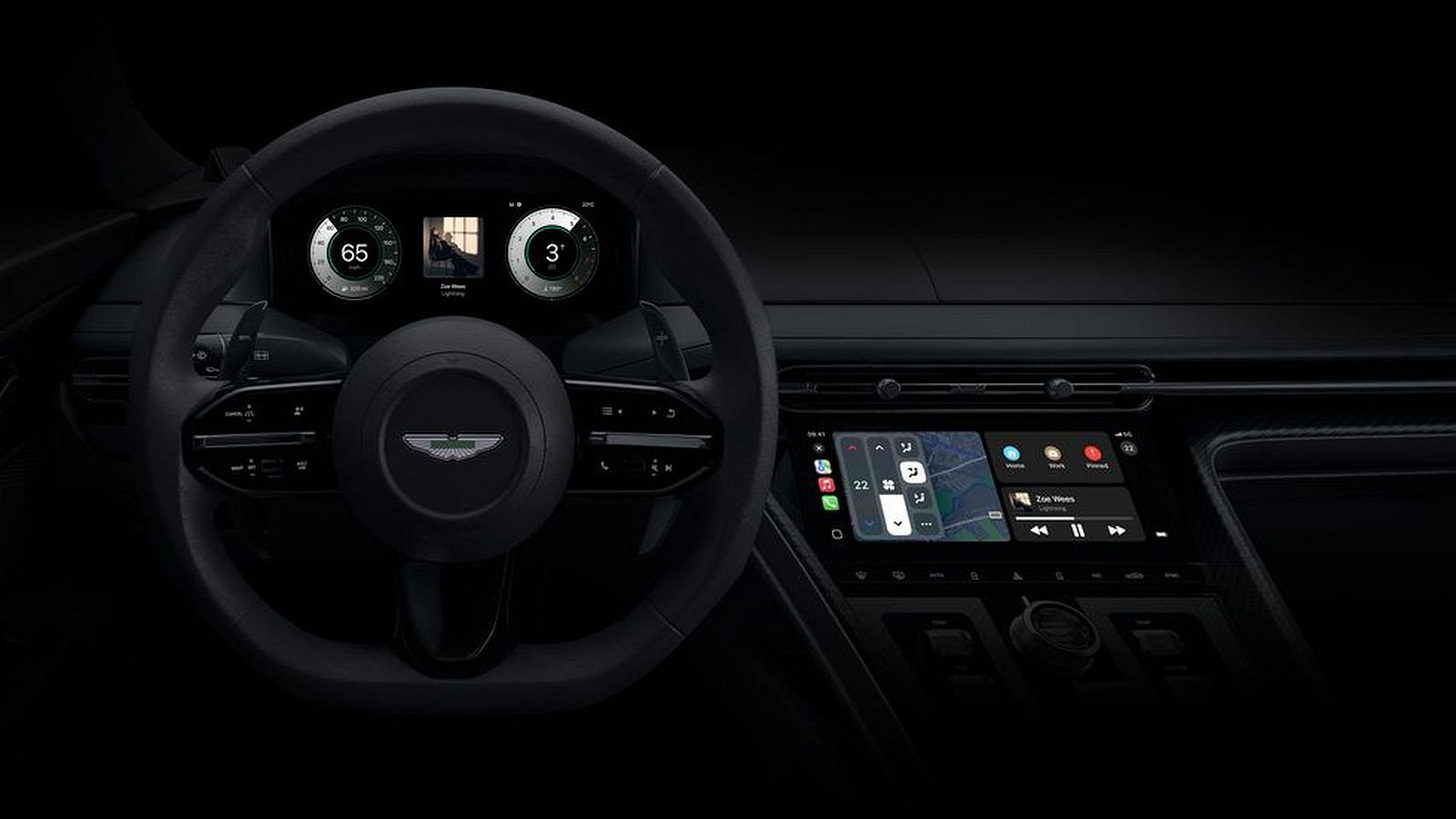
This week, Apple — along with Porsche and Aston Martin — revealed the next level of CarPlay integration, which takes over the digital gauge cluster and, if fitted, the passenger screen.
Alas the images they’ve released are so poor that I’m starting to wonder if I’ve got it all wrong.
I should caveat what I’m about to write with the fact that I’m basing this perspective on two images alone.
One shows the new CarPlay in a Porsche dashboard, and another shows it in an Aston Martin’s, and they’re unlikely to be entirely representative of the final product.
But with that out of the way, I’m surprised that the images have been released at all.
Back when Apple announced the second generation of CarPlay at WWDC in 2022, the company was widely mocked by car and interface design types for the naivety of their prototype gauge packs.
My take, titled Why Does Apple’s New CarPlay Look So bad? was a little more hopeful.
In it I suggested that as the mock-ups were being shown at a developer conference, they were more proof-of-concept than production-ready, an amuse bouche to tempt customers and potential car company clients alike.
You’d think that with the benefit of over a year’s development time and the partnership of Porsche and Aston, Apple might have shown something more sophisticated this week, especially as the mock-ups are now being placed in dashboards that clearly belong to their partners.
But no. The graphics on display are just as naive as last year’s, only this time they almost completely ignore the design heritage of their partner brands, too.
Sure, the Porsche gauges come in three, with the centre gauge larger than the outers, just like the Taycan’s. But otherwise there’s nothing about the design that suggests an awareness of Porsche’s iconic instrumentation. This has, for the most part, featured crisp white type in a consistent house style on a black background with red needles.
In the mockup, the only thing that lets us know that this is a Porsche gauge pack is the Porsche logo on the steering wheel, and the wordmark in the centre of one of the gauges. Surely one of the benefits of Porsche’s legacy in gauge design is that the driver needn’t be reminded twice what they’re behind the wheel of.
The final nail in the coffin comes with the representation of Porsche’s “iconic” houndstooth cloth behind the gauges. This suggests a cringe-inducing return to the stylistic skeuomorphism of Apple’s iOSs 1–6, rather than a respectful reimagining of Porsche’s graphic identity for the digital age. That this proposed design looks worse than the cluster in any new-for-24 Porsche simply beggars belief.

Things are barely better in the Aston Martin image. While the vein of gauge heritage doesn’t run nearly so deep as it does at Porsche, Aston still has a few hallmarks worth preserving. One example is the contra-rotating speedometer and rev counter that have been around since the DB9 and now live in digital form in the DBX. None of these hallmarks are anywhere to be found in the mock-up.
Aston doesn’t escape the cringe either, with “Handmade in Great Britain”, etched in pixels that definitely will not be handmade, much less in Great Britain, arranged around the tachometer. At least when “Power Beauty Soul” flashed up in the digital displays of Aston’s older cars, it reinforced the intended qualities of the brand.

What makes this whole situation all the more baffling is that Apple has previously demonstrated an understanding of the importance of the historical context of design as part of projecting in to the future.
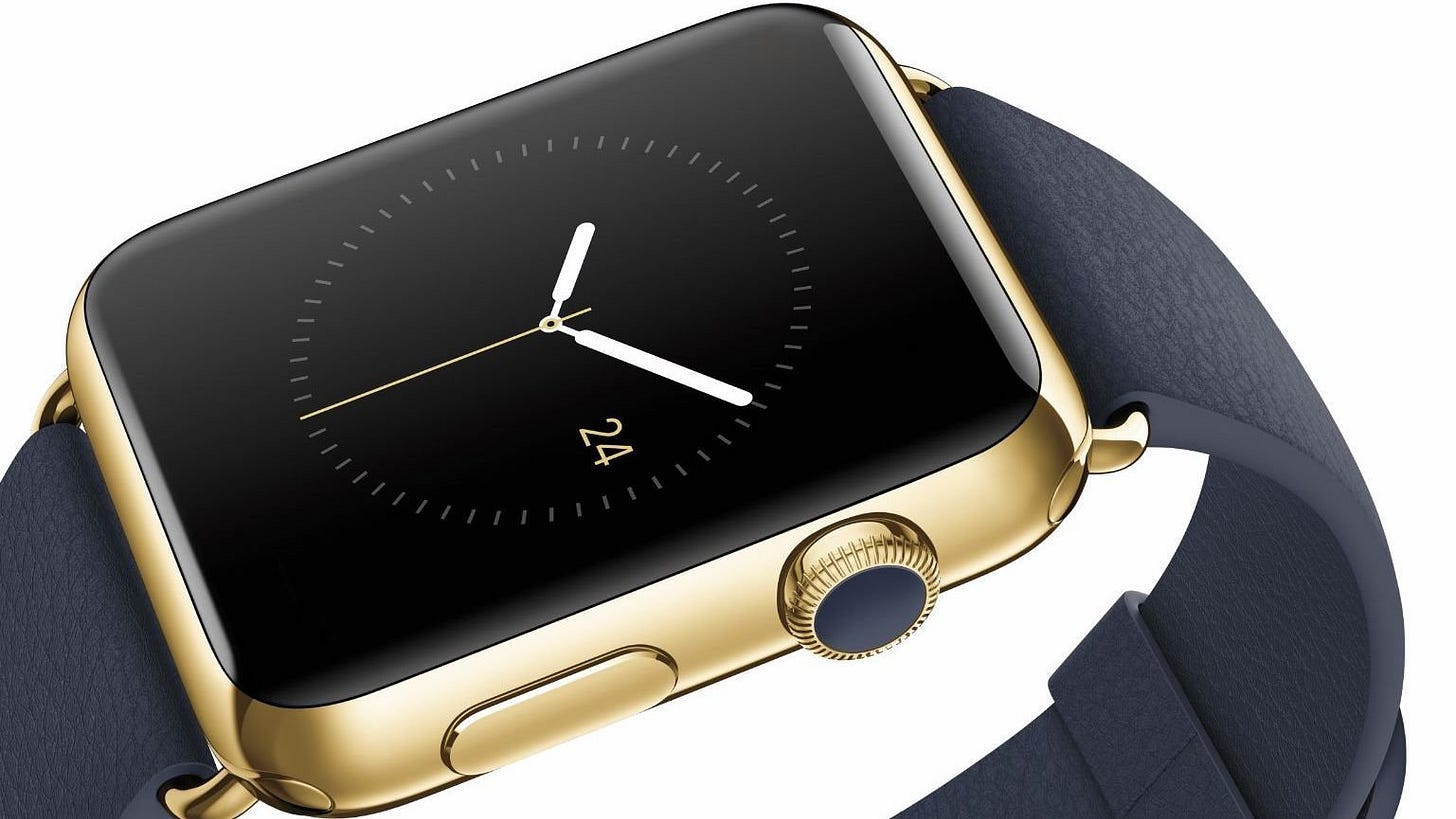
When developing the Apple Watch, the design team produced a book on the history of clock and watchmaking so that they could get to grips with what makes a good watch great. If you’re going to produce a new take on a long-established luxury item, which the Watch was intended to be, then you’d better understand the norms of the category before you start.
Surely it can’t be lost on Apple that the history of automotive gauges shares quite a lot with the history of clocks and watches and is just as rich in brand associations. But, perhaps with the departure of design history obsessives like Ive and his acolytes, this reverence for what came before has departed too.
If history is out, then perhaps what Apple has shown might look to the future, but there’s precious little evidence of that, either.
Way back in 2015, UsTwo and Car Design Research co-published a series of five blog posts and prototypes, all informed by primary and secondary research, that explored a first-principles approach to digital cluster design.
While they too missed the boat on effective brand design in their proposals (the aesthetic of Mercedes cluster is particularly cringeworthy now), they effectively defined a new interface paradigm to take advantage of the design freedoms offered by digital displays. Having just reread the report, the thinking behind this project – and the design opportunities it afforded – still stand. If they haven’t already, Apple, Porsche and Aston Martin would do well to read it.
Who owns the dashboard — the driver’s means of interacting with a car and one of the most sophisticated brand, interface and industrial design projects in existence — is a touchy subject at the moment.
It’s the source of a new pissing match between Ford (who’s staying the course with Android Auto and CarPlay) and GM (who, to great ridicule and disastrous early effect, is going their own way).
It’s also the driver of remarkably strong consumer preference, with the vast majority of buyers in the U.S., the world’s second-largest car market (and largest iPhone market), refusing to consider a new car unless CarPlay is a feature.
So it’s a domain in which it’s prudent, from a design strategy perspective, to get it right from the get go, and that includes setting customers’ expectations in advance of a launch. This is especially true in a market that can be as fundamentally conservative as luxury automobiles.
One of the reasons people buy into brands like Porsche and Aston Martin is because they have evolved, in many ways, extremely slowly. They have stood, historically, for the considered evolution of function, form, and visual communication. This roots the buyer in an arc of time and a cultural context longer and larger than their own, giving them a sense of belonging. So even when introducing a product as radical as the electric Taycan, Porsche still saw fit to imbue its digital dash with an animated update of the brand’s longstanding graphic style. They extended and evolved a familiar frame of reference rather than creating an entirely new one.
But in failing to communicate any deep understanding of Porsche and Aston Martin’s heritage, the images released this week suggest that Apple hasn’t understood this important aspect of luxury brand design.
Or, on the other hand, if these designs are the work of the car makers’ own design teams, I can only surmise that Apple’s restrictions on CarPlay interface design are so punitive as to make authentic brand expression impossible.
More importantly, in failing to offer anything meaningfully new by way of interface and interaction, Apple appears to have scored a monumental home goal.
The domain of the in-car interface desperately needs a rethink, especially as drivers are becoming more, not less, distracted by in-car technology. With its incredible legacy in making technology disappear so that users can focus on the most important job at hand, Apple should have absolutely nailed this brief. That’s what so many of us in the industry have been hoping for.
Now, my only hope is that these images have been rush released in some ill-advised attempt to meet Apple’s publicly-stated end-of-23 deadline for a vehicle announcement.
On the current evidence, they should’ve waited.
If you appreciated this Looking Out Long Form, get in touch with Drew and let him know.
Better yet, share it with someone who you think might appreciate it, too!


Very interesting Drew.
I'm also intrigued to see how these systems will date, both aesthetically and practically, and to what extent they will do so in a manner befitting of a one day 'classic' vehicle. Will they age elegantly, or more like an Aston Martin Lagonda? (Although that does have a certain retro coolness attached to it now).
I hate to quote such an exclusive vehicle, but it's interesting to contrast these attempts with Gordon Murray Automotive's treatment of the T.50 screens and user interface. The design brief for that, as I understand it, was for all information to be presented in stripped down monochrome with no superfluous graphics, and no touch screen interface, all system inputs being handled via aerospace grade switchgear, the dials and switches milled from solid . Maybe enjoying the ASMR like pleasure of beautiful switch gear is part of the high end vehicle experience. The other interesting aspect of T.50 is that the rev counter remains as an elegant, analogue dial, preserving a direct and visceral connection with the engine.